Colic-Soothing Play Mat Design For Calm, Stable Comfort
21st May•11 min read
Choosing a baby play mat isn't just about picking a safe surface: it's about understanding what colors and patterns actually support how your infant's vision develops, then matching that insight to what works with your floor in your specific home. The science is clearer than most parents realize, and it directly challenges what many manufacturers put on their mats.
Newborns see in a profoundly limited way[3]. Their retinal cone cells are underdeveloped, so they perceive a muted, low-contrast world (think desaturated and blurry). This isn't a deficiency your play mat needs to "fix" with primary-color overstimulation. Rather, it's how the infant visual brain is designed to organize itself[3].
The timeline matters: For age-by-age color and pattern recommendations, see our visual development play mat guide.
By six months, your infant has moved from sensing raw wavelength to extracting perceptual meaning from color[2]. This shift is profound, and it happens without neon triangles or high-saturation nursery aesthetics.
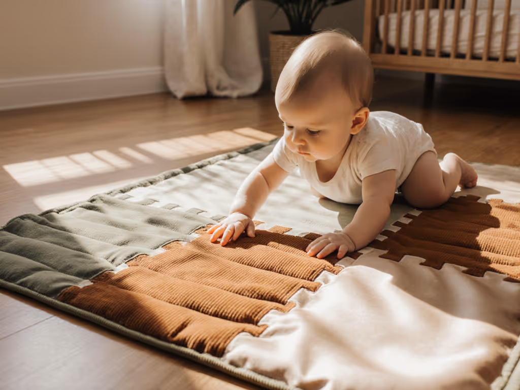
When I first crawled beside my daughter on a tile floor to feel how a play mat actually performed, I discovered something that shaped how I think about product design: a mat that looked plush and reassuring bottomed out on grout lines and created uneven support. Another, thinner one distributed impact better and stayed put when she pulled up. What felt safe (pure thickness) turned out to be less effective than how the material distributed force and worked with the surface below.
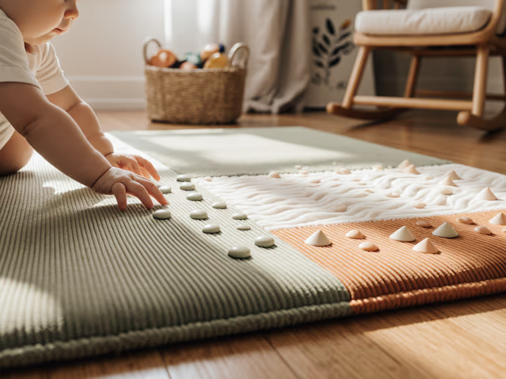
Color science reveals a parallel truth. Support is distribution; thickness alone is a blunt instrument. Likewise, color development isn't about intensity; it's about the distribution and range of colors your infant encounters. Natural scenes contain a specific balance of warm, cool, and neutral tones, with the greatest variability along the blue-yellow axis[2]. An infant's developing visual system attunes to that statistical distribution, not to whatever pops loudest.
This reframes the play mat color question: you're not decorating for visual stimulation; you're supporting the infant's emerging ability to parse a naturalistic visual diet.
High contrast is useful early; variety matters later.
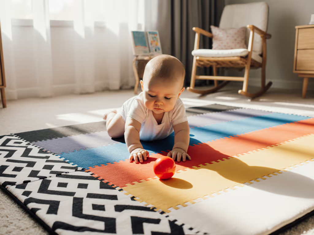
Newborns benefit from stark contrast (black and white or dark-and-light patterns) because they're working with underdeveloped color vision and need clear luminance cues to track movement and locate objects[3][8]. This is why many developmental play mats feature high-contrast black-and-white sections for the first few weeks.
But overstimulation (a mat saturated with primary colors, busy prints, and high-saturation pastels) doesn't accelerate development; it can create visual fatigue without serving a developmental purpose. For evidence-backed palettes by age that balance stimulation and calm, explore our play mat color psychology guide. By 4 months, when infants' color discrimination aligns with natural scene statistics[1][2], a mat that mimics real-world color distribution (neutrals, softer saturation, natural gradients) actually supports their developing color vision more effectively than one that doesn't.
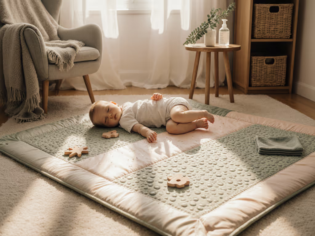
The practical trade-off: mats with a high-contrast section for newborn-to-3-month use, paired with a neutral, softer-palette main surface for 4+ months and beyond, serve the full arc of visual development without relying on clutter.
Your floor type constrains not just how a mat sits, but how colors appear and perform visually. For surface-specific tips on grip, cushioning, and edge safety across hardwood, carpet, tile, and vinyl, see our safe play mat surfaces guide.
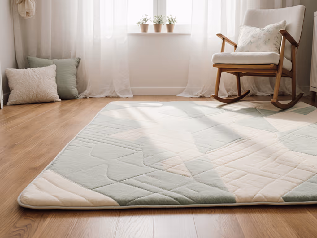
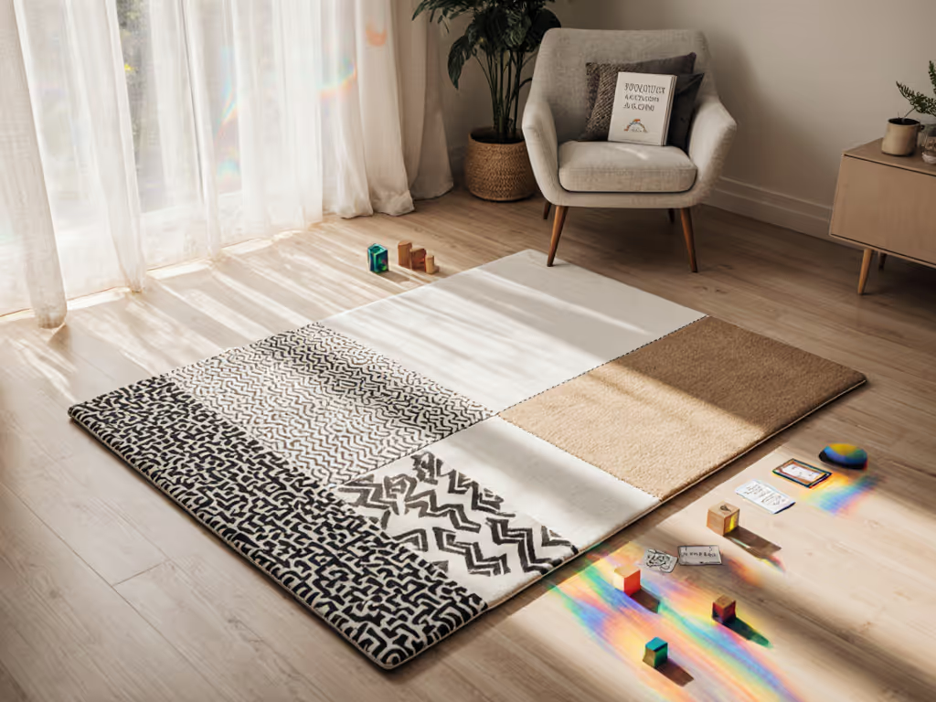
On hardwood or light laminate: Darker or warm-toned mats can blur into the floor, reducing the visual separation infants need to perceive depth and boundaries. A mat with a defined edge color or subtle tonal contrast to the floor works better. Avoid light-colored mats on light floors unless the mat has a textured surface that creates visual definition.
On tile: Grout lines create a grid that fragmented mat patterns can fight with visually. A solid or subtly patterned mat in warm neutrals or soft grays harmonizes better than a busy print. (Puzzle-tile mats are notorious for this: visual confusion, plus the practical nightmare of pieces separating and crevices trapping debris.)
On carpet: A low-pile carpet can work well with most mat colors, but dense patterns on both surfaces create visual noise. If your carpet is patterned, choose a simpler mat; if it's solid, you have more freedom.
The point: color choice isn't isolated. Your infant's developing visual system will parse color in context, against the floor, the room lighting, and surrounding furnishings. A mat color that supports color perception development is one that creates visual clarity in your specific space.
Here's the practical hierarchy:
For 0-3 months:
For 4+ months:
For lasting use (newborn through toddler):
Light or neutral mats show stains; dark mats show dust. Get step-by-step care by material in our complete play mat cleaning guide. Knowing your infant's typical mess pattern (spit-up, puree, milk stains, pet hair) and your cleaning tolerance matters as much as knowing the color science. A mat in a neutral tone that hides moderate staining and can withstand daily wiping or vacuuming is more developmentally useful than one that requires constant cosmetic maintenance.
If your floors are hardwood or laminate and you're concerned about slipping, avoid mats with shiny or slick finishes in any color; choose one with a textured surface that grips reliably and distributes weight evenly so it doesn't slide when your infant pulls up or crawls with momentum.
Support is distribution; thickness alone is a blunt instrument. The same principle applies to color: what matters is how it distributes across your infant's developing visual landscape, not how loudly it announces itself.
The intersection of color science and play mat design remains underexplored in consumer guidance. If you're drawn to evidence-based choices, consider these deeper dives:
The goal isn't to engineer perfect visual input (infants are remarkably robust learners), but to align your mat choice with how vision actually develops, and to choose colors that work with your floor, space, and lifestyle rather than against them.